Monday, December 27, 2004
Impending...
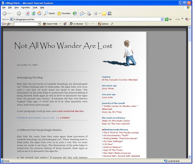
Spent the day OCD-ing in Photoshop. Result: new blogdesign. Comments welcome.
To be fair, the navigation bar featuring a jamming Willow was much cooler, albeit not as thematic. Pity.
posted by boyhowdy |
10:49 PM | 
Comments:
I like it...cleaner...hoo, never thought of a gradient as a background. You know you could get a random graphics code to display different banners on top every time you loaded the page. Good way to show off baby/family pics. I'd also make the text black (and not grey, although it's prob. black - just the way my monitor is displaying it). Anyway, my two cents...
I think it's lovely...Set it free. ~jo
# posted by : 2:51 PM, December 28, 2004
I like it! Elizabeth
# posted by : 3:26 PM, December 28, 2004
I have two graphic design suggestions. First and most minor, space out the kerning between the words "all" and "who"- it looks a little too close together. "not" and "all" could also use a bit of breathing room. Color wise, I hate the grey. I think a grey could work, but choose a warmer grey more from the red range, rather than a cool, steel grey.The improvement would be two fold: it would overall look more inviting, and less coldly technilogical, anbd it would make Willow, whose pants and shadow are in the blue range, stand out more and seem brighter. Instead of grey, I also think a very subdued peach or a tasteful light grey-green could work nicely. Both would make willow appear to be more on a landscape and exploring, and less like she's just pasted on. if you change the color, remember to make the shadow a darker shade of the new color, to make it look like she's really walking on the page. I like the use of the gradient to provide a souce of light for her shadow, though. Subtly done.
Thanks to all for the feedback, Matt especially. Tried some other shades of greyish, as Matt suggested, but I've decided, for now, I like the cool steel (I'm hoping for a kind of natural/organic in tension kind of thing, almost black-and-white, between the organic light casting shadow and the creeping technometal of the other side, both off-screen, I guess). I value his points, though -- another few hours in photoshop, and I can see exactly where he is coming from, and agree that there'd be some value in making such a change. I did make some sneakyspace between the letters mentioned, as suggested. Big diff, there -- got to make more width for text, so all is good. Now, if only I was actually working on redesigning the ORGANIZATION -- sidebar stuff, etc. -- like I said I was going to... :-p
# posted by boyhowdy : 9:45 PM, December 28, 2004
|
About Boyhowdy
Cybersociologist. Father.
Teacher. Poet. Audiophile.
Pondering media, education,
communications, parenting,
culture, community and
self
on the web since 2002.
ongoing
All the Concerts I've Ever Attended
a lifetime of music, updated regularly
a year ago
Becoming Santa
two years ago
Poor Sick Baby
three years ago
Road Trip
four years ago
Living In The Past
story of the year
The Ladybug Who Had No Spots
poem(s) of the month
Heat Sonnet
Today, A Sonnet
Warm Winter
rethinking media literacy
>What If He Is Right, Too?
>Spam A Lot
>Uncyclopedia: The Anti-Wiki
>The Bibliography As Medium
>Calendars As Mass Media
>The F Word In The Faculty Lounge
>On Documentary "Truth"
>Writing Media: That Extra Space
>On Teen Suffrage
>I M Fine
>Child As Medium
>Sign Of The Times
>Now That's Media Exposure
>Second Self / Second Self, Updated
>Muppets Go Global
>Missing Molly: On Virtual Absence
>Is PowerPoint The Devil?
>A Curricular Epiphany
>Rethinking Media Literacy: A Rant
>It's Pronounced peeps
blog as medium
>Bleached Blanket Blogosphere
>Blog, In A Nutshell
>Oblogatory
>Making Public The Lost Segue
>Grasping At Blogs
>A Definitive Definition
>Romancing The Blog
>The Dichotomies List
>You Know You're A Blogger When...
>Everyone Loves A Blog
>Deep Thoughts, Shallow Paragraphs

or Atom Feed
|
 |
| coming soon |
|
12/31 New Year's Eve in Northfield
1/1 Last "Hangover Special" Breakfast for the Siblings in Newfane, VT
1/14 You Say It's Your Birthday (34 Isn't That Old, Is It?)
2/16 - 2/24 Bermuda!
|
|
| now listening |
|
 |
|
| tinyblog |
|
aka remaindered linkstinyblog archive
boyhowdy's tinyblog is
powered by del.icio.us
+ javascripted by Alan Levine
|
|
| archives |
|
2002
november: 17
24
december: 01
08
15
22
29
2003
january: 05
12
19
26
february: 02
09
16
23
march: 02
09
16
23
30
april: 06
13
20
27
may: 04
11
18
25
june: 01
08
15
22
29
july: 06
13
20
27
august: 03
10
17
24
31
september: 07
14
21
28
october: 05
12
19
26
november: 02
09
16
23
30
december: 07
14
21
28
2004
january: 04
11
18
25
february: 01
08
15
22
29
march: 07
14
21
28
april: 04
11
18
25
may: 02
09
16
23
30
june: 06
13
20
27
july: 04
11
18
25
august: 01
08
15
22
29
september: 05
12
19
26
october: 03
10
17
24
31
november: 07
14
21
28
december: 05
12
19
26
2005
january: 02
09
16
23
30
february: 06
13
20
27
march: 06
13
20
27
april: 03
10
17
24
may: 01
08
15
22
29
june: 05
12
19
26
july: 03
10
17
24
31
august: 07
14
21
28
september: 04
11
18
25
october: 02
09
16
23
30
november: 06
13
20
27
december: 04
11
18
25
2006
january: 01
08
15
22
29
february: 05
12
19
26
march: 05
12
19
26
april: 02
09
16
23
30
may: 07
14
21
28
june: 04
11
18
25
july: 02
09
16
23
30
august: 06
13
20
27
september: 03
10
17
24
october: 01
08
15
22
29
november: 05
12
19
26
december: 03
10
17
24
03
2007
january:
current
|
|
| about |
|
oldwork
Northfield Mount Hermon School
>MED/SOC 221: Media Literacy
>HIS 321: Modern American Culture
>MED 05: Mass Media Messages
>MED 06: Ed Tech 101
>MED 08: Advanced Web Design
school
Marlboro College
>BA, Cyberstudies
>MAT, Teaching w/ Technology
play
Watermelon Pickle Poems (broken)
Rethinking Media Literacy
Reading The Future
see me / contact me / give me stuff
guestmap / hitcounter
|
|
| links |
|
loci
City Year
Boston Museum of Science
Falcon Ridge Folk Festival
The Iron Horse
highbrow
Kairos
Utne
McSweeney's
Daily Jigsaw Puzzle
nobrow
Fark
Boing Boing
American Feed
Customers Suck
The Onion / A.V. Club
|
|
| blogs |
|
+abraxas
+alex halavais
+alterego
+amish tech support
+amitai etzioni
+blogatron
+brokentype
+bumptious
+burnt toast
+dave barry
+don't link to us
+everyone shut up...
+fnord: essence of being
+i want to hug kafka
+life - listed chronologically
+liloia.com
+media yenta
+mrs_fezziwig
+next-to-last song
+parenting isn't pretty
+the shifted librarian
+there are no more tickets...
+tvtattle
+universal rule
+webraw
+zack, a livejournal
<< ?
new england blogs # >>
<< ? edublog # >>
<<
?
blogging mommies
#
>>
<<
?
verbosity
#
>>
<<
?
jewish bloggers
#
>>
-Anthroblog social anthropologist's blog on blogging
-Anti-Bloggies.com yearly blog awards with real prizes
-The Blog A Day Tour Lawrence posts in other people's blogs
-The Blogproject student research on blogs, cyberidentity, and hypertexts
-Blogger Unofficial FAQ blog fix blog problems
-Recently Changed Weblogs recently changed weblogs
=blogger bloghosting
=bravenet guestmap
=reinvigorate counter, hit-tracker
=enetation comments
=online bonsai icons tree
--> blogroll me
|
|
| quotes |
|
I hate quotations. Tell me what you know.
- Ralph Waldo Emerson
And you know, when you study the semiotics of Through the Looking Glass or watch every episode of Star Trek, you've got to make it pay off, so you throw a lot of study references into whatever you do later in life.
- Matt Groening
She wrote secret web pages with gentle empty spaces where the universe could creep in and rest when it got overwhelmed.
- Robin Williams
Cable news networks...often act as if the best way to present information is to serve the viewer two opposing advocates battling it out. But in many instances, this ends up confusing rather than illuminating. Not every fact is debatable, not every opinion equal -- or worth equal time.
- David Corn
Any sufficiently advanced technology is indistinguishable from magic.
- Arthur C. Clarke
This "telephone" has too many shortcomings to be seriously considered as a means of communication. The device is inherently of no use to us.
- Western Union internal memo, 1876
The wireless music box has no imaginable commercial value. Who would pay for a message sent to nobody in particular?
- David Sarnoff's associates, in response to his urging for investment in radio, 1920s
Computers in the future may weigh no more than 1.5 tons.
- Popular Mechanics, 1949
There is no reason anyone would want a computer in their home.
- Ken Olson, President and founder of Digital, 1977
|
|
Subject: HIGH TECHNIQUE ELECTRICAL HOME APPLIANCES---COMPUTERIZE GAS KITCHEN
Date: Mon, 7 Jan 2002 08:53:27 +0000 (UTC)
From: "MRS WANG"
Organization: FUJIAN HUALI TECHNOLOGY CREATING CO,LTD
Do you like to comprehend a computer housemaid ? Do you like to own a blue soldier ? Today , SHIELD gives you the answer .
SHIELD is a computerize gas kitchen which is controlled automatically and intelligently. It is a world wide invention , is a new generation of the gas kitchen..
What is the benefits that SHIELD brings to us ? Firstly , it will relieve you out of the kitchen ,you shouldn't be in when you cook the food .Second ,it solved the problem that the food would be burned ,the soup be out and the gas be leaked .And it will make your family safer and healthier.
Do you want to understand much more merits about SHIELD? Please see the followings:
1. amounts and the kinds of food (boiling water, porridge, rice , soup ,fish ,meat ,medicine), SHIELD will regulate the temperature and time to cook automatically ,and the soap won't be out ,the food won't be burned .It will turn off the electric and gas source by itself ,and tell you by springing out the music .
2. when needing and you can set five times to light fire .
3. ,it will send out a big fire ,and when the temperature reached 100 ,it would change the flame .If the temperature is below 100 ,it will turn to be a big fire ,and keep the flame blue .The containing of CO is less than 0.04% of total .(standard :less than 0.05%) . And then it reduced the pollute .
4. B"CAutomatically limit the time of offering gas :It is 30 minutes that offering the gas. When cooking ,it won't be out whenever it is blew or watered .Because when the fire is out , it will light automatically. When the gas leaked ,the density reached up a level or the temperature of the platform is over 80 ,SHIELD will warn you and turn off the electric and gas source .
5. need ,it can set the temperature and heat the food by itself .
6. according to the container .
7. 70.51%(standard :higher than 55%).Comparing to the common gas kitchen ,it can save more than 40%source of total .
8. natural gas and marsh gas to cook , also can use many kinds of pans, such as iron pan ,aluminum pan and high pressured pan. SHIELD computerize gas kitchen is a housemaid , is a soldier .Is there anything more important than the safety and health of your family ?
Let us share more happy in our lives .Not to bore for the burned food, not to be sad for no time for cooking .For you love your family ,please begin with SHIELD .Possessing SHIELD is possessing love .
-Spam E-mail for a Home Appliance "published" at We Made Out In A Tree And This Old Guy Sat And Watched Us,
submitted by Jeremy Sacco
|
|

|
|

